


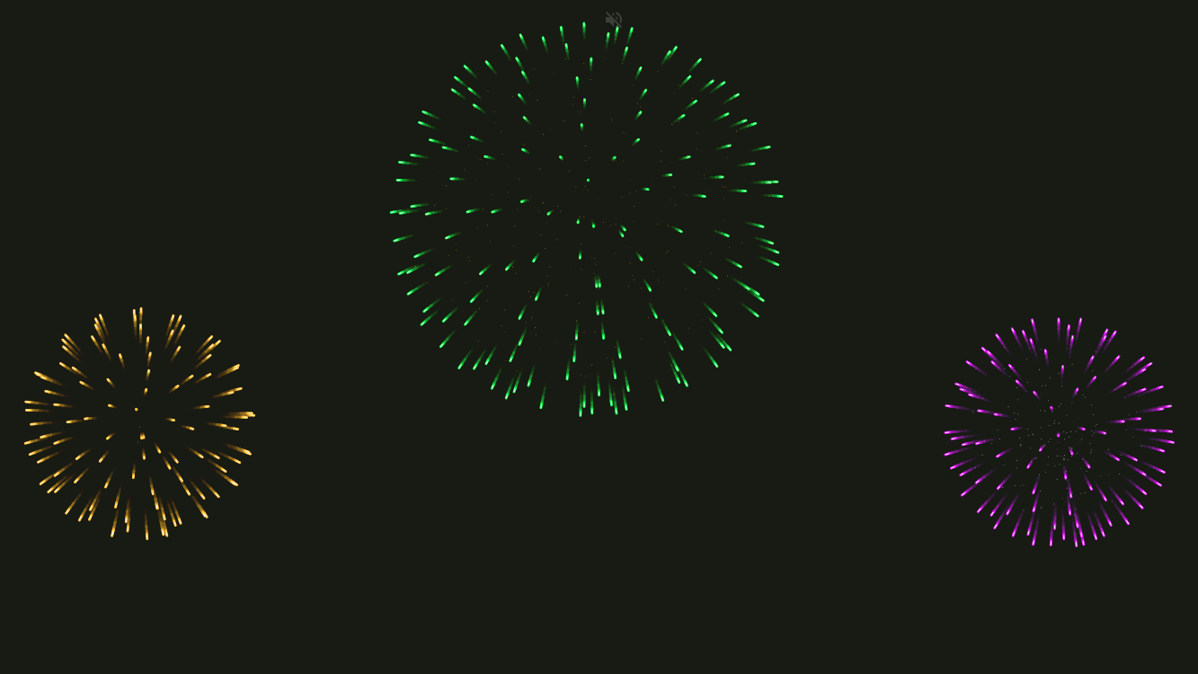
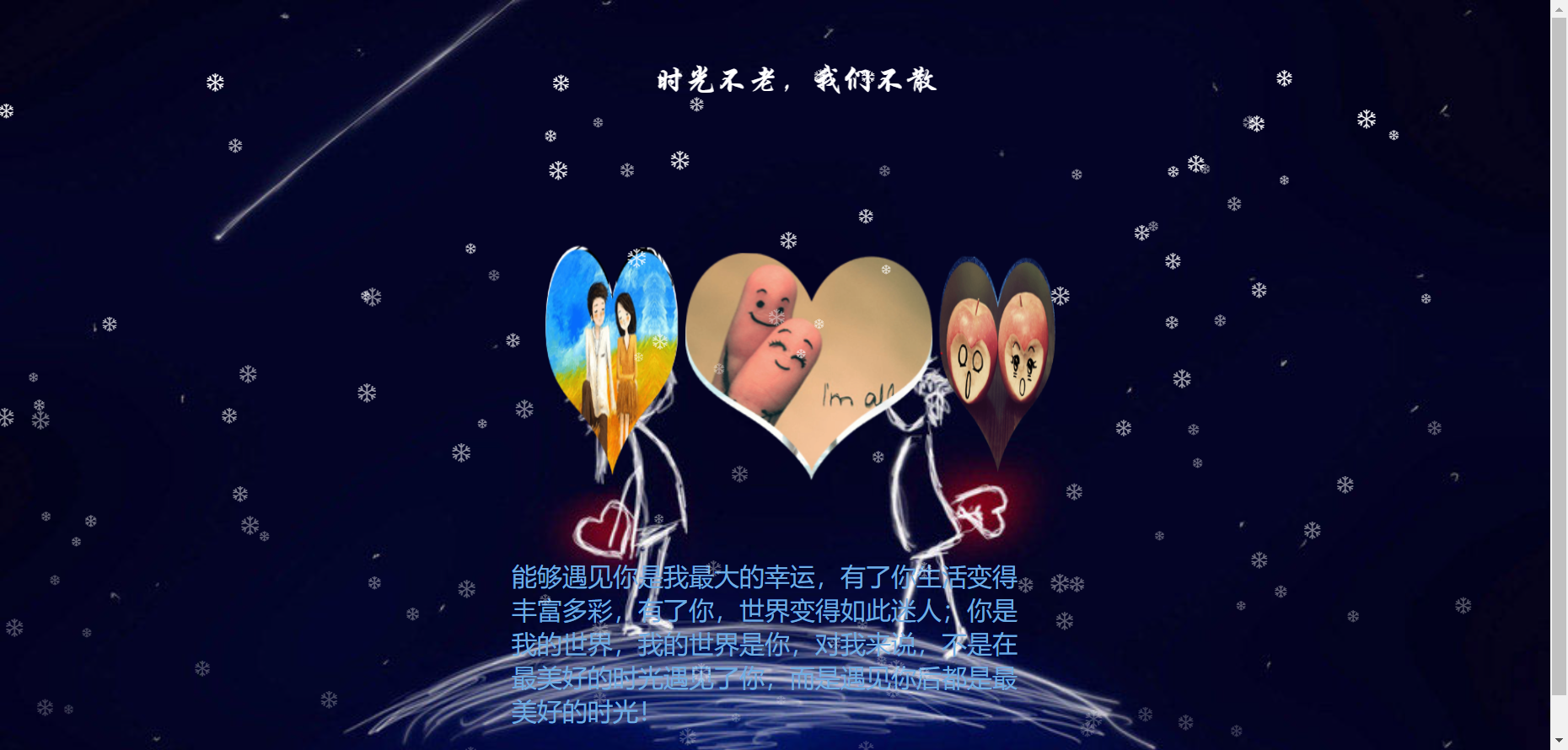
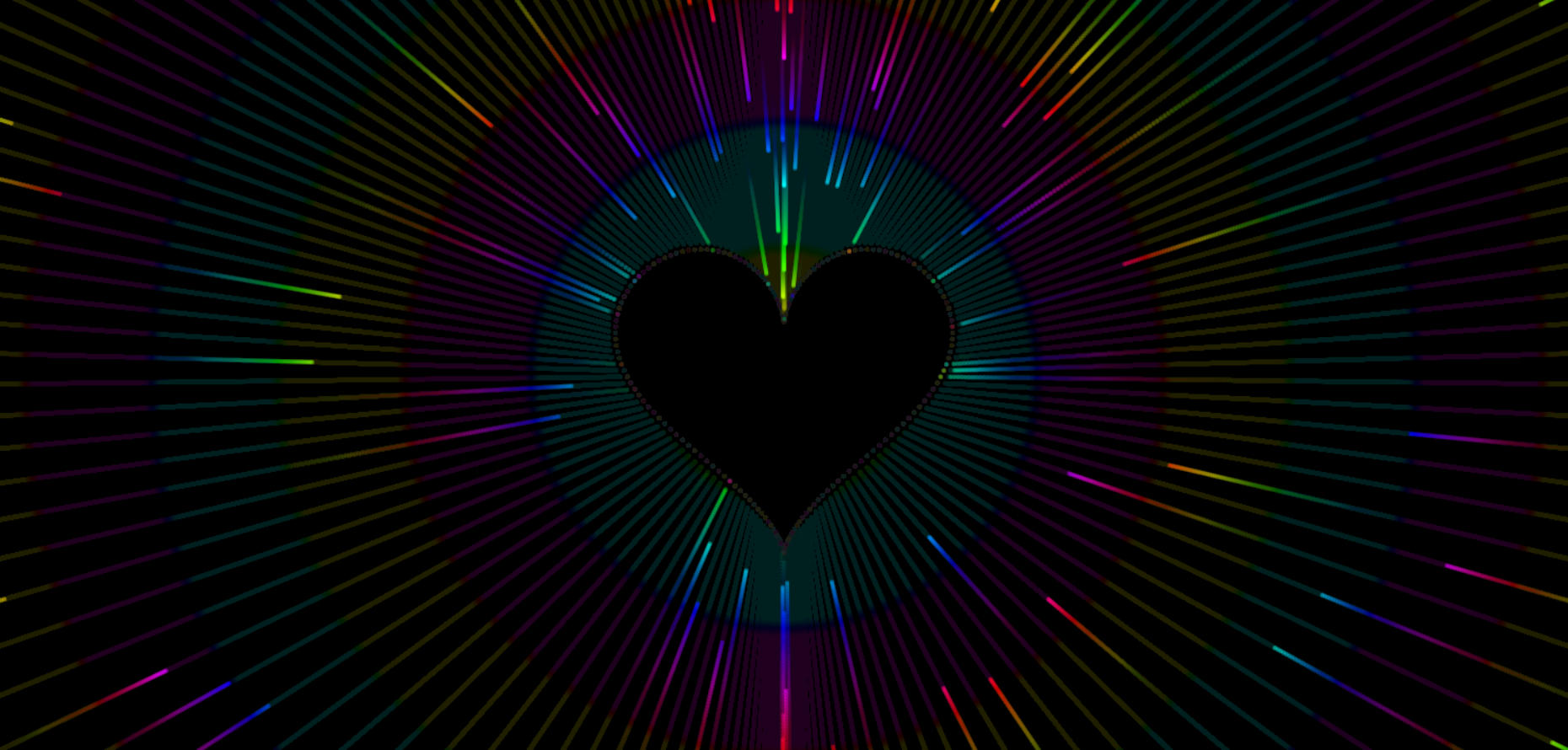
效果预览

在线体验
完整源码
- 别人如何访问你的代码效果,请看这里https://b23.tv/LvCrB7Y
- 文字版教程https://blog.ttxgzs.com/archives/64
HTML
<!doctype html>
<html>
<head>
<meta charset="utf-8">
<title>爱你们</title>

<link type="text/css" href="css/style.css" rel="stylesheet" />

</head>
<body>

<div class="back"></div>
<div class="love"></div>
<div class="love-1"></div>
<div class="love-2"></div>

</body>
</html>
CSS
@charset "utf-8";
body{overflow-x: hidden}
.back {
    position: fixed;
    padding: 0;
    margin: 0;
    top: 0;
    left: 0;
    width: 100%;
    height: 100%;
    background: rgb(252, 235, 236);
    animation-name: back;
    animation-duration: 2s;
    animation-iteration-count: infinite;
    }
.love {
    position: absolute;
    background-color: rgb(207, 105, 112);
    width: 250px;
    height: 250px;
    margin: auto;
    top: 0;
    left: 0;
    bottom: 0;
    right: 0;
    transform: rotate(-45deg);
    animation-name: love;
    animation-duration: 3s;
    animation-delay: 1s;
    animation-iteration-count: infinite;
}
.love::before {
    content: "";
    position: absolute;
    background-color: rgb(207, 105, 112);
    border-radius: 50%;
    width: 250px;
    height: 250px;
    top: -125px;
    left: 0px;
}
.love::after {
    content: "";
    position: absolute;
    background-color: rgb(207, 105, 112);
    border-radius: 50%;
    width: 250px;
    height: 250px;
    left: 125px;
    top: 0px;
}

@keyframes back {
    50% {
        background: rgb(250, 211, 214);
    }
}
@keyframes love {
    50% {
        transform: scale(1.2) rotate(-45deg);
    }
}
/*love-1*/
.love-1 {
    position: absolute;
    background-color: rgb(231, 132, 139);
    width: 125px;
    height: 125px;
    margin: auto;
    top: 0;
    left: 0;
    bottom: 0;
    right: 0;
    transform: rotate(-45deg);
    animation-name: love-1;
    animation-duration: 2s;
    animation-delay: 1s;
    animation-iteration-count: infinite;
}
.love-1::before {
    content: "";
    position: absolute;
    background-color: rgb(231, 132, 139);
    border-radius: 50%;
    width: 125px;
    height: 125px;
    top: -62.5px;
    left: 0px;
}
.love-1::after {
    content: "";
    position: absolute;
    background-color: rgb(231, 132, 139);
    border-radius: 50%;
    width: 125px;
    height: 125px;
    left: 62.5px;
    top: 0px;
}

@keyframes love-1{
    50% {
        transform: scale(1.2) rotate(-45deg);
    }
}
/*love-2*/
.love-2 {
    position: absolute;
    background-color: pink;
    width: 62.5px;
    height: 62.5px;
    margin: auto;
    top: 0;
    left: 0;
    bottom: 0;
    right: 0;
    transform: rotate(-45deg);
    animation-name: love-2;
    animation-duration: 1s;
    animation-delay: 1s;
    animation-iteration-count: infinite;
}
.love-2::before {
    content: "";
    position: absolute;
    background-color: pink;
    border-radius: 50%;
    width: 62.5px;
    height: 62.5px;
    top: -31.25px;
    left: 0px;
}
.love-2::after {
    content: "";
    position: absolute;
    background-color: pink;
    border-radius: 50%;
    width: 62.5px;
    height: 62.5px;
    left: 31.25px;
    top: 0px;
}

@keyframes love-2 {
    50% {
        transform: scale(1.2) rotate(-45deg);
    }
}
© 版权声明
文章版权归作者所有,未经允许请勿转载。
THE END


暂无评论内容